Validating a user registration form sounds so simple doesn't it? Just make sure that the email provided is formed correctly, and that the password meets whatever criteria and you're all set, right? For me, it's not until I start implementing the code that I realize there are actually a lot of moving parts. This is especially true when wiring up a full stack JavaScript application, in this case a React and Apollo client with an Express and GraphQL Yoga (also Apollo) server. There are quite a few considerations that end up impacting the user registration process.
- What credientials are required?
email/passwordoremail/name/passwordor something more complex and annoying? - What validations take place, and do they take place on the client or server - does it require
regex? - What does the
schemalook like for thesignupmutation? - How do the error messages get displayed to the user - text, color, position on page?
- Under what conditions do these errors get displayed?
Disclaimer
There are probably as many ways to accomplish this task as there are developers implementing it. This is just one of the ways I stumbled upon lately and liked the way it turned out.
Server Logic
The details of the server are not as important as the GraphQL Mutation resolver we are going to be focusing on, but seeing everything in action can be helpful. Clone my server boilerplate and follow the README to run your own server or just follow along.
git clone https://github.com/benjaminadk/graphql-server-boilerplate-tsThe only code this article really cares about is the validation logic, the resolver for the signup mutation and the corresponding frontend markup.
Schema
- the
signupmutation returns an array ofErrorornull - if
nullis returned we can assume everything went and a new User is in the database - the
pathof eachErrorrefers to the name of the field the error is on, so eitheremail,name, orpasswordin this case - the
messageof eachErroris a short text message describing the error
type Error {
  path: String!
  message: String!
}

type Mutation {
  signup(email: String!, name: String!, password: String!): [Error!]
}
Yup Error Validation
- Yup is used for validation
- the syntax is similar to React Prop Types
- provides various validations on type, min/max length, overall object shape, etc
- pass custom error message as the last argument
formatYupErrormaps Yup error shape to our schema
const yup = require('yup')

const emailNotLongEnough = 'email must be at least 3 characters'
const nameNotLongEnough = 'name must be at least 3 characters'
const passwordNotLongEnough = 'password must be at least 8 characters'
const invalidEmail = 'email must be a valid email'

const validator = yup.object().shape({
  email: yup
    .string()
    .min(3, emailNotLongEnough)
    .max(100)
    .email(invalidEmail),
  name: yup
    .string()
    .min(3, nameNotLongEnough)
    .max(100),
  password: yup
    .string()
    .min(8, passwordNotLongEnough)
    .max(100)
})

const formatYupError = err => {
  const errors = []
  err.inner.forEach(e => {
    errors.push({
      path: e.path,
      message: e.message
    })
  })
  return errors
}

module.exports = { validator, formatYupError }
Signup Mutation Resolver
Userrepresents however your server accesses its database modeltry/catchwithabortEarly: falsewill trigger errors being returned before any other logic runs- check database for existing user with
emailand throw error if there is one - finally create
Userif no errors are triggered but returnnull
const { User } = require('./User')
const { validator, formatYupError } = require('./errorHelpers')

module.exports = async (_, args) => {
  const duplicateEmail = 'email already taken'

  try {
    await validator.validate(args, { abortEarly: false })
  } catch (err) {
    return formatYupError(err)
  }

  const { email, name, password } = args

  const userExists = await User.findOne({
    where: { email },
    select: ['id']
  })

  if (userExists) {
    return [
      {
        path: 'email',
        message: duplicateEmail
      }
    ]
  }

  const user = User.create({ email, name, password })

  await user.save()

  return null
}
Client Logic
Again, the exact front end setup isn't as important as the SignupForm component itself. I like the Higher Order Component or HOC version of Formik called withFormik. The InnerForm component contains the JSX markup for the form recieves props from the outer component. The outer SignupForm if where Formik options are defined that determine how the form behaves.
Signup Form
import React from 'react'
import { withFormik } from 'formik'

import { normalizeErrors, formatError } from '../../../utils/errorHelpers'
import { validUserSchema } from './validation'
import { Form, Field, Button } from './styles'
import Svg from '../../shared/Svg'

const fields = ['email', 'name', 'password']

const InnerForm = props => {
  const { values, touched, errors, isSubmitting, handleChange, handleBlur, handleSubmit } = props

  return (
    <Form onSubmit={handleSubmit}>
      {fields.map(field => {
        let error = Boolean(errors[field] && touched[field])

        return (
          <Field key={field} error={error}>
            <label>{field}</label>
            <input
              type={field}
              onChange={handleChange}
              onBlur={handleBlur}
              value={values[field]}
              name={field}
              placeholder={field === 'email' ? 'Ex. johndoe@mail.com' : ''}
              spellCheck={false}
            />
            <div className='error'>{formatError(errors[field])}</div>
          </Field>
        )
      })}
      <Button type='submit' disabled={isSubmitting}>
        {isSubmitting ? <Svg name='logo' /> : 'Sign up'}
      </Button>
    </Form>
  )
}

const SignupForm = withFormik({
  mapPropsToValues: () => ({ email: '', name: '', password: '' }),

  validationSchema: validUserSchema,

  handleSubmit: async (values, { props, setErrors, setSubmitting }) => {
    await new Promise(resolve => setTimeout(resolve, 3000))
    const errors = await props.submit(values)
    if (errors) {
      setErrors(normalizeErrors(errors))
    } else {
      props.onFinish()
    }
    setSubmitting(false)
  },

  displayName: 'SignupForm'
})(InnerForm)

export default SignupForm
Formik is helpful because it takes care of the little annoying details like touched - which is true if the user has put the cursor in a given field. If the user submits the form without entering any fields and leaves the entire form blank all errors are triggered. Once the user enters valid input into a field that was displaying an error state, that field automatically returns to a normal state giving the user instant feedback. Formik also handles the overall form state and event handlers for each field and the form as a whole. Formik's validation is designed to, optionally, let Yup to validate everything. To understand the big picture, it is probably best to see the form in action.

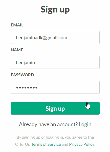
This is my full component from an OfferUp clone I am working on. I put a setTimeout on the handleSubmit function to illustate another built in feature of Formik - submission state. One to the callbacks available to Formik's handleSubmit option is setSubmitting. This is automatically set to true when handleSubmit is called and corresponds to the isSubmitting prop that gets passed to the InnerForm. I used Styled Components to build the form components and passing isSubmitting through to the Button component allows me to simultaneously disable the button, preventing multiple submissions, and display a loading spinner, letting the user know what is happening. Formik does offers Form, Field and other wrapper components but I found creating my own easier to customize.
Validation
Formik offers multiple validation options and is very flexible in this regard. In fact, setting up validation is not even required. Remember, our server is already running its own validation. We could totally ignore client side validation, but it is better for performance to limit HTTP requests when we don't need them and the user will receive feedback quicker with client side validation. Another validation strategy is to write inline JavaScript functions Formik's validate option, but this is more work than we want to do. Finally, the last option is to pass a Validation Schema to Formik.
Our validationSchema will look pretty familiar. It is nearly identical to the server side validation but has required added. The GraphQL schema itself throws and error is an empty string is passed to the resolver thanks to the ! (not null) operator. The server validation is still relevant because it throws the duplicateEmail error when a user tries to signup with an already existing email. The validation is also helpful for testing, and in development we may be entering data through a GraphQL GUI or programmatically and we want to keep or database clean and data correct.
import * as yup from 'yup'

const emailNotLongEnough = 'email must be at least 3 characters'
const emailRequired = 'Please enter an email address'
const invalidEmail = 'email must be a valid email'
const nameNotLongEnough = 'name must be at least 3 characters'
const passwordNotLongEnough = 'password must be at least 3 characters'
const fieldRequired = 'This field is required'

export const validUserSchema = yup.object().shape({
  email: yup
    .string()
    .min(3, emailNotLongEnough)
    .max(100)
    .email(invalidEmail)
    .required(emailRequired),
  name: yup
    .string()
    .min(3, nameNotLongEnough)
    .max(100)
    .required(fieldRequired),
  password: yup
    .string()
    .min(8, passwordNotLongEnough)
    .max(100)
    .required(fieldRequired)
})
Mutation Container
A container component with logic that communicates with the server is required for a full example. The submit function calls the signup mutation and the onFinish function gets called only when everything goes through successfully. The cool part about this setup is that the duplicateEmail error from the server integrates smoothly into the Formik system. Now we have client and server validation wrapped up into the same package.
import { useMutation } from 'react-apollo'
import { withRouter } from 'react-router-dom'
import gql from 'graphql-tag'

const signupMutation = gql`
  mutation Signup($email: String!, $name: String!, $password: String!) {
    signup(email: $email, name: $name, password: $password) {
      path
      message
    }
  }
`

const SignupContainer = props => {
  const [mutate] = useMutation(signupMutation)

  async function submit(values) {
    const { data } = await mutate({
      variables: values
    })
    if (data) {
      return data.signup
    }
    return null
  }

  function onFinish() {
    props.history.push('/')
  }

  return props.children({ submit, onFinish })
}

export default withRouter(SignupContainer)
The container is used with the Render Props pattern to pass submit, onFinish or any other desired logic to its children.
<SignupContainer>
  {({ submit, onFinish }) => <Signup submit={submit} onFinish={onFinish} />}
</SignupContainer>
Helper Functions
The trained eye may have noticed a couple helper functions in the SignupForm example. The normalizeErrors function converts the errors thrown by the server to the Formik format and formatError just capitalizes the first letter for styling purposes.
export const normalizeErrors = errors => {
  return errors.reduce((acc, val) => {
    acc[val.path] = val.message
    return acc
  }, {})
}

export const formatError = error => error && error[0].toUpperCase() + error.slice(1)
To be extra thorough the Formik error, touched and state format is a JavaScript object. Each object contains a key with the name attribute of each field in the form.
Styled Components
The following are fairly basic Styled Components I used. Everything is fairly staightforward as I use an error prop to toggle the red color indicating a validation error. Skip ahead for more important information.
- Relevant parts of the theme I used
const theme = {
  primary: '#00ab80',
  black: '#4a4a4a',
  white: '#ffffff',
  error: '#e05666',
  grey: [
    '#FAFAFA',
    '#F2F2F2',
    '#E6E5E5',
    '#D9D8D8',
    '#CDCCCB',
    '#C0BFBF',
    '#B3B2B2',
    '#A7A5A5',
    '#9A9898',
    '#817E7E',
    '#747272',
    '#676565',
    '#5A5858',
    '#4D4C4C',
    '#403F3F'
  ]
}- Form, not so complicated
export const Form = styled.form`
  width: 300px;
`- Field, standard CSS
export const Field = styled.div`
  display: flex;
  flex-direction: column;
  color: ${p => (p.error ? p.theme.error : p.theme.black)};
  label {
    color: currentColor;
    font-size: 14px;
    font-weight: 700;
    text-transform: uppercase;
    margin-bottom: 8px;
  }
  input {
    color: currentColor;
    border: 1px solid ${p => (p.error ? 'currentColor' : p.theme.grey[4])};
    border-radius: 3px;
    font-size: 16px;
    padding: 12px 16px;
    margin-bottom: 8px;
    &::placeholder {
      color: ${p => p.theme.grey[5]};
    }
  }
  .error {
    display: ${p => (p.error ? 'block' : 'none')};
    color: currentColor;
    font-size: 14px;
  }
`-
Button
- uses Styled Components
keyframes - uses
lightenanddarkenfrom Polished
- uses Styled Components
const spin = keyframes`
  0% {
    transform: rotate(0deg);
  }
  100% {
    transform: rotate(360deg);
  }
`

const Button = styled.button`
  width: 100%;
  background-color: ${p => p.theme.primary};
  color: ${p => p.theme.white};
  border: 0;
  border-radius: 3px;
  font-size: 20px;
  font-weight: 700;
  line-height: 26px;
  padding: 8px 20px;
  margin-top: 20px;
  cursor: pointer;
  &:hover {
    background-color: ${p => `${darken(0.1, p.theme.primary)}`};
  }
  &:disabled {
    background-color: ${p => `${lighten(0.1, p.theme.primary)}`};
  }
  svg {
    justify-self: center;
    width: 25px;
    height: 25px;
    animation: ${spin} 1s linear infinite;
}- Svg markup for spinner
- Checkout Svg Icons With No Artistic Ability to learn more about how I make my icons in React
<svg viewBox='0 0 50 50' xmlns='http://www.w3.org/2000/svg'>
  <path
    d='M49.941 23.322c1.292 19.172-18.683 32.553-35.957 24.086C5.969 43.477.66 35.575.06 26.677-1.233 7.505 18.742-5.874 36.016 2.593a24.9754 24.9754 0 0 1 13.161 16.062L44.4 24.602l-4.909-5.421c-1.346-3.382-3.9-6.35-7.613-8.169-5.005-2.454-10.941-2.056-15.571 1.046-9.976 6.683-8.968 21.644 1.816 26.931 5.005 2.453 10.94 2.054 15.57-1.047 4.716-3.16 6.979-8.172 6.912-13.134l3.95 4.359 5.32-6.62c.027.257.049.517.066.775z'
    fill='#ffffff'
  />
</svg>